

As Venminder grew, small design inconsistencies started adding up across the product. Teams were moving fast, but without a shared design language, the UI became fragmented, which slowed development and created friction for users.
I led the creation of Venminder’s first centralized design system—a scalable, reusable foundation that brought product, engineering, and marketing teams onto the same page. It improved consistency, sped up delivery, and set the product up to scale more smoothly over time.
As Venminder’s product grew, the UI was built by different teams at different times. Everyone was moving fast, but without a shared system in place, design decisions were often made independently. Over time, this led to inconsistencies across the product that started to slow teams down and affect the overall experience.

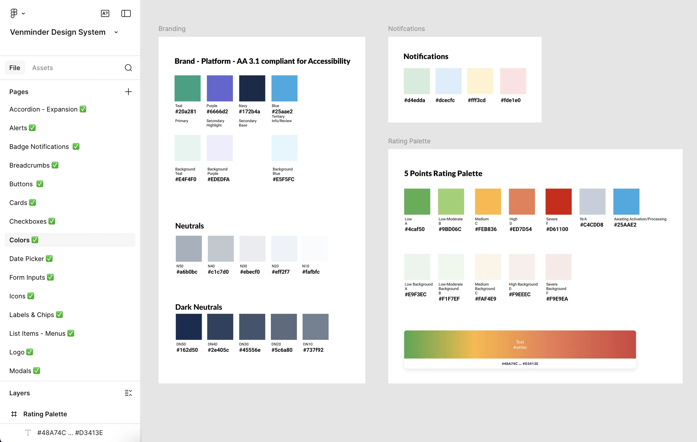
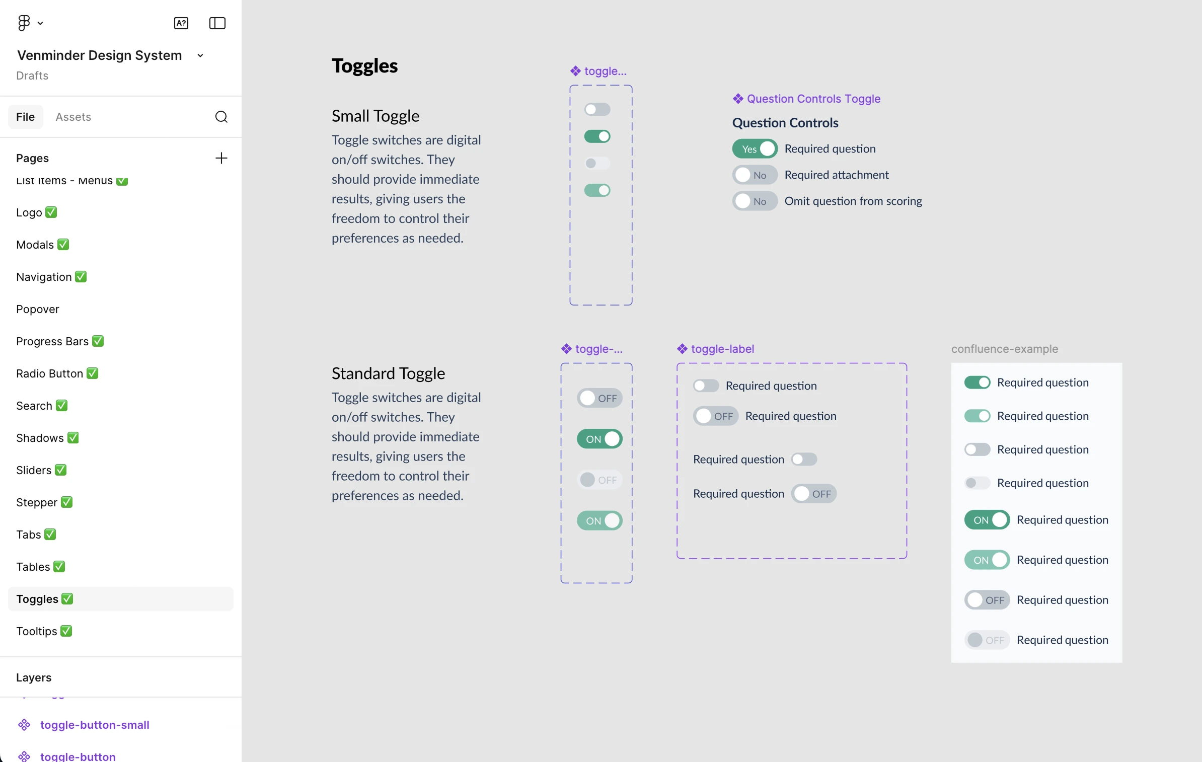
The process started with a thorough audit of the product UI to understand what already existed and where things were breaking down. For tracking purposes, I also wanted to take inventory of how many different variants of the same component we had and where they were located in the platform. This helps with QA and makes it easier for developers to find the components they need.
I identified the following core components as the foundation of the design system and included their status:

Before designing individual components, I established a set of foundational rules to guide decisions across the system. These guardrails helped ensure consistency and reduced subjective design debates later on. This included defining:
With foundations in place, I focused on building a core set of reusable components that addressed the most common product needs. Each component was designed to be flexible enough to work across multiple contexts without creating unnecessary variants.
For each component, I considered:

Design system updates were reviewed in weekly design reviews, where components and patterns were shared early to gather feedback and align on decisions. In parallel, designs were regularly reviewed with the lead engineer to get input on feasibility, edge cases, and long-term scalability.
This close feedback loop helped shape components that were not only visually consistent, but also practical to build, reuse, and maintain in code. By involving engineering early, we reduced handoff friction, caught potential issues sooner, and built stronger, more flexible components.
I'm a Product Designer based in Chicago with experience in delivering 0 → 1 products that meet business goals.

